
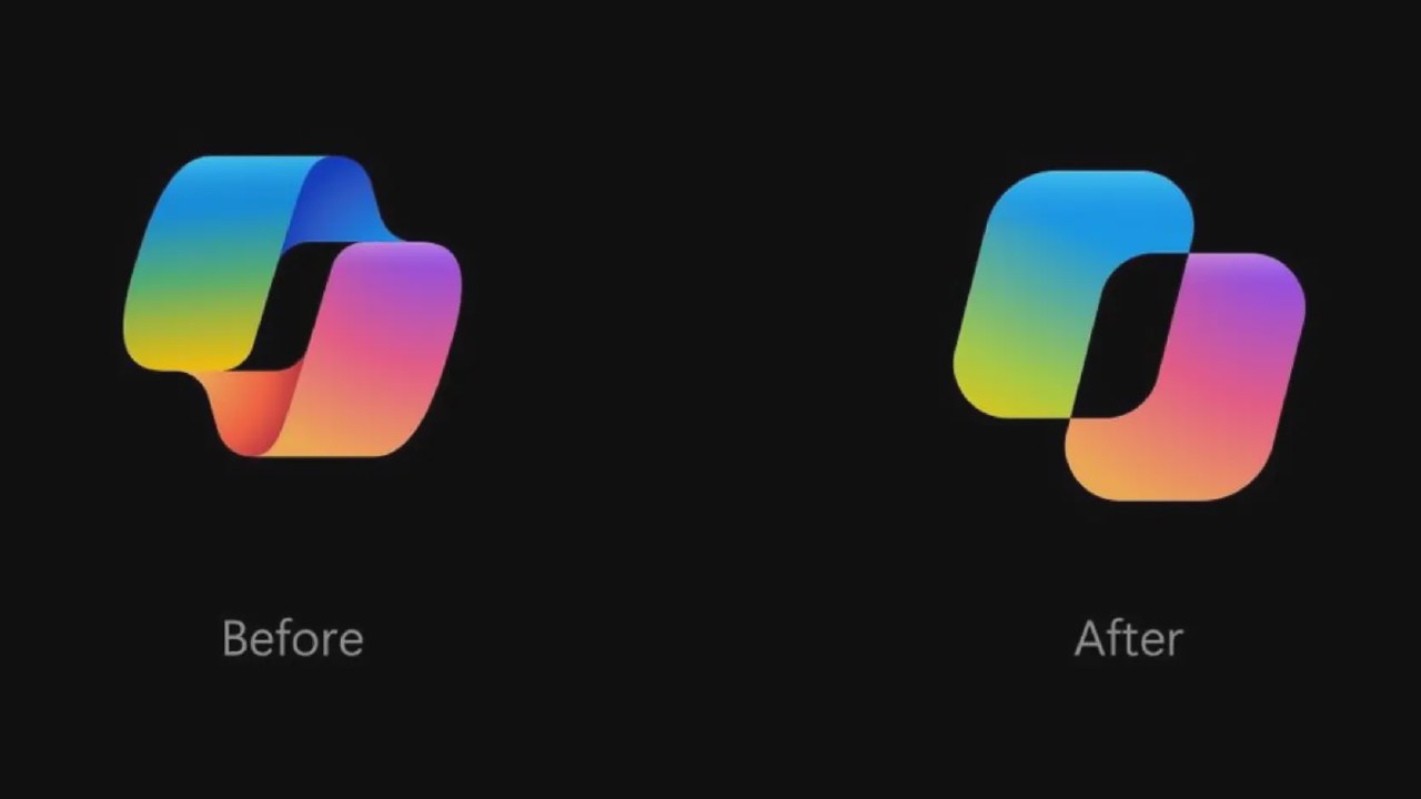
Microsoft recently detailed the multi-month design process behind the new Copilot visual identity. The design team focused on creating a dynamic icon that acts as an interactive element rather than a static logo, reflecting the continuous dialogue between users and AI models.
The development process involved extensive iterations on graphic structure, typography, and color schemes. Designers experimented with shapes, eventually settling on a two-square configuration that allows for unified silhouettes and fluid movement. The new wordmark combines Segoe and Segoe Serif fonts to balance readability with brand personality.
Color selection proved challenging, as many initial combinations failed to align with Microsoft's broader product ecosystem. The team conducted rigorous testing, including printing various versions on paper to evaluate curves and line weights, frequently discarding concepts that did not meet their standards.
A key feature of the redesign is the introduction of state-based animations. The icon now changes its appearance to signal specific AI actions, such as thinking, planning, or retrieving information. These visual cues provide real-time feedback to users, reducing the need to wait for text responses.
Microsoft has integrated these dynamic animations across its product suite, including Office. The company views this evolution as a shift toward a more intuitive visual language, aiming to make complex AI capabilities more accessible and understandable for everyday users.