
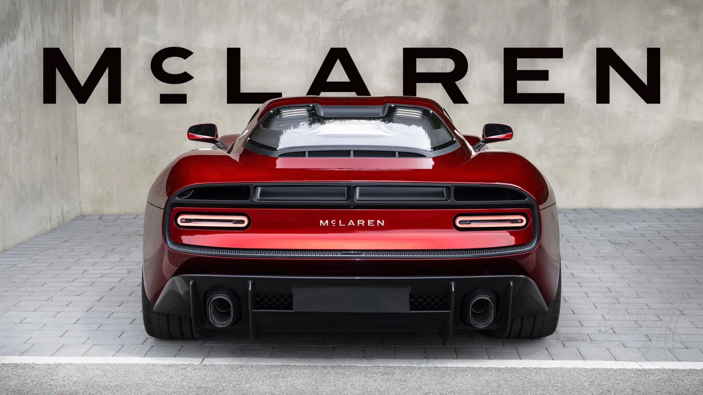
McLaren has unveiled a new minimalist wordmark logo, which will be applied across all future vehicle models, merchandise, and digital channels. The design draws inspiration from the original signage of the workshop owned by the parents of founder Bruce McLaren in Auckland, New Zealand.
The company is currently undergoing a major business expansion. Plans include the construction of a second factory in the UK, the launch of an in-house engine development project, and the diversification of its product lineup, which will now feature front-engine models with two rows of seats, including SUVs.
The McL 6GT is the first model to feature the new branding, having debuted at the Monterey Car Week last month. While the new wordmark will take a dominant role, the company will retain the existing 'Speedmark' symbol as a secondary identifier. A custom font, McLaren Sans, has also been introduced for all brand communications.
The rebranding includes a shift to a 'Midnight' color palette to emphasize a luxury market position. The iconic 'Papaya Orange' will now be primarily reserved for the racing division, though it will still appear in select contexts for road-going vehicles. The 'McL' abbreviation will also be used in vehicle naming and badging.