
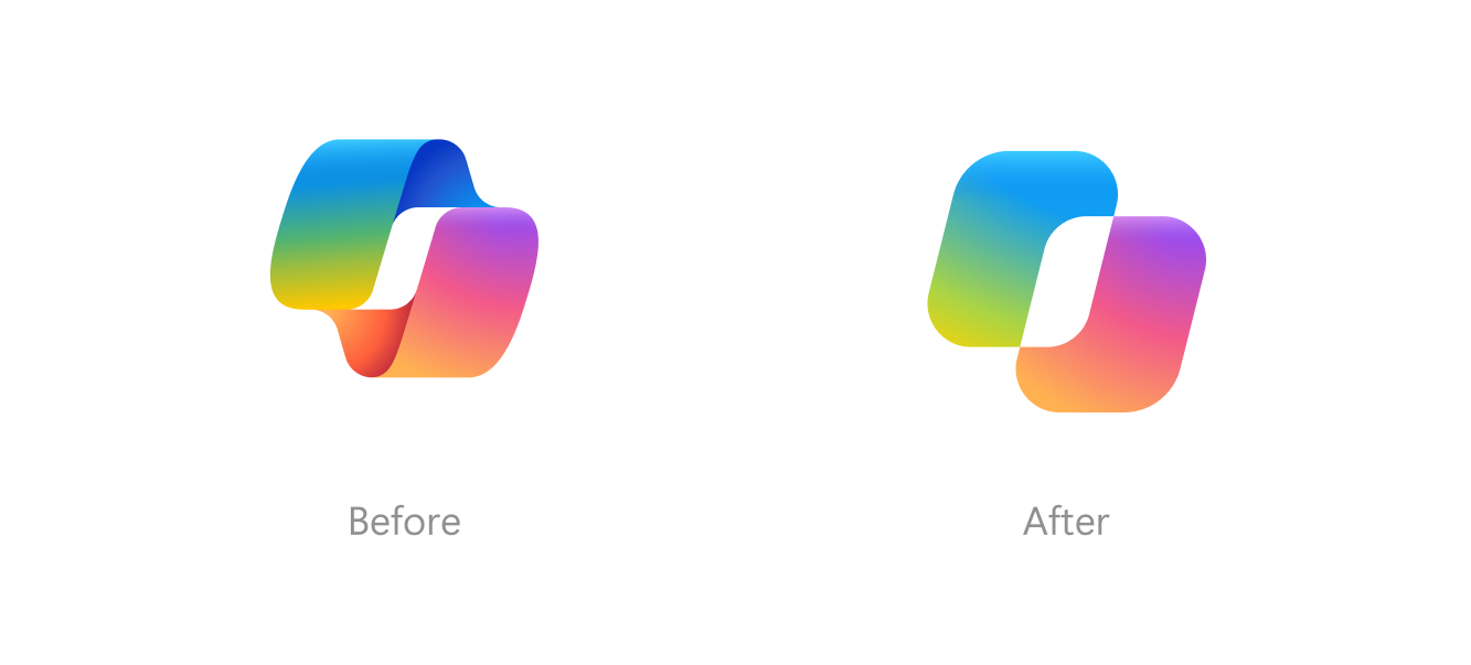
Microsoft Design has introduced a redesigned Copilot icon, transitioning from a static logo to a dynamic system composed of two squares. The update aims to better communicate the AI's processing states, such as thinking, planning, and information retrieval, through interactive movement.
The design team experimented with various proportions, angles, and spacing for the rectangular shapes. The final version ensures the elements remain recognizable both when separated and when combined into a single silhouette. The icon retains its signature gradient color scheme, which shifts along curves to create depth.
Microsoft has developed a unified motion language for the icon, utilizing three distinct movement patterns. These animations allow the two squares to shift positions and interact before returning to their unified form, providing visual feedback during user interactions across digital and physical platforms.